Premier Skating Group
Completed: July 2023
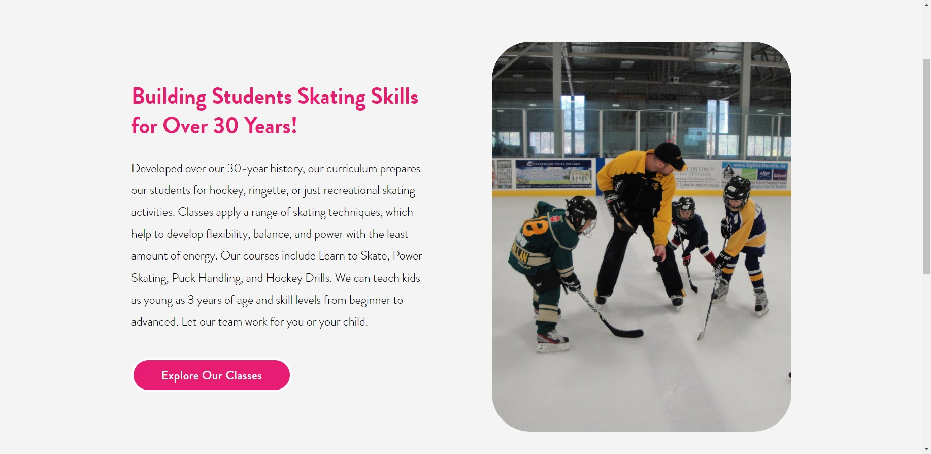
Our client approached us with an existing website that wasn't working for her the way she wanted and she also wanted to refresh the look and feel with more youthful and energetic branding. So that's what we did! We started with her branding and implemented new typography and colours, evolving her yellow and black palette to include a vibrant pink and turquoise. We also incorporated some youthful graphics and splashes of colour throughout the design and helped to optimize the flow and presentation of her offerings. We also helped to consult with CRM options, which the client dove into, selecting a new service and providing us with the code to integrate on her Classes page as Squarespace's built in option wasn't complex enough for her needs. All in all, we are so happy with how this design turned out and wish our client continued success with her well established business.


